Typesetting review: Tsuritama This entry was posted by herkz.
Tsuritama typesetting review
Commie
(me)
This would probably look better with a third layer shifted like 1-2 pixels to the left.
This should be to the left and up a bit.
This is fine.
Yeah, this is my bad (more like why I shouldn’t encode because it’s off by one frame somehow).
While the font is okay here…
And decent here…
It’s far too thick here.
See above.
While this is aligned correctly it looks dumb. I blame the Japanese sign being rotated in a strange way.
Good.
Nothing wrong but it could be fancier.
Might look better as 2 layers.
WhyNot
No blur. Also, even if they wanted to use a shadow (which I did) it should be on the other side.
This should be 2 layers.
Color is off and the letters should be farther apart (i.e. use fsp).
There’s a lot wrong with these (like no blur). Also, Yuki Keito is not a name, it’s two names. This sign should be composed of two separate parts.
At least these have blur.
Not nearly enough blur.
Font should be bigger, no blur.
Needs blur at the very least.
These are okay.
Grades
Commie: B. Some fonts could be a lot better (like the names).
WhyNot: C. Most of these are just there. Almost everything could be improved by better fonts and blur. Not sorted by time.










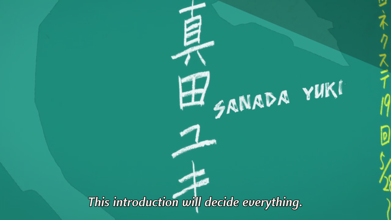




![[WhyNot] Tsuritama - 01 [C776C852]_001_1729](http://notredreviews.files.wordpress.com/2012/04/whynot-tsuritama-01-c776c852_001_1729.png)
![[WhyNot] Tsuritama - 01 [C776C852]_001_9233](http://notredreviews.files.wordpress.com/2012/04/whynot-tsuritama-01-c776c852_001_9233.png)
![[WhyNot] Tsuritama - 01 [C776C852]_001_9879](http://notredreviews.files.wordpress.com/2012/04/whynot-tsuritama-01-c776c852_001_9879.png)
![[WhyNot] Tsuritama - 01 [C776C852]_001_13257](http://notredreviews.files.wordpress.com/2012/04/whynot-tsuritama-01-c776c852_001_13257.png)
![[WhyNot] Tsuritama - 01 [C776C852]_001_13981](http://notredreviews.files.wordpress.com/2012/04/whynot-tsuritama-01-c776c852_001_13981.png)
![[WhyNot] Tsuritama - 01 [C776C852]_001_14039](http://notredreviews.files.wordpress.com/2012/04/whynot-tsuritama-01-c776c852_001_14039.png)
![[WhyNot] Tsuritama - 01 [C776C852]_001_14219](http://notredreviews.files.wordpress.com/2012/04/whynot-tsuritama-01-c776c852_001_14219.png)
![[WhyNot] Tsuritama - 01 [C776C852]_001_14260](http://notredreviews.files.wordpress.com/2012/04/whynot-tsuritama-01-c776c852_001_14260.png)
![[WhyNot] Tsuritama - 01 [C776C852]_001_16824](http://notredreviews.files.wordpress.com/2012/04/whynot-tsuritama-01-c776c852_001_16824.png)
![[WhyNot] Tsuritama - 01 [C776C852]_001_16868](http://notredreviews.files.wordpress.com/2012/04/whynot-tsuritama-01-c776c852_001_16868.png)
![[WhyNot] Tsuritama - 01 [C776C852]_001_23333](http://notredreviews.files.wordpress.com/2012/04/whynot-tsuritama-01-c776c852_001_23333.png)
![[WhyNot] Tsuritama - 01 [C776C852]_001_30613](http://notredreviews.files.wordpress.com/2012/04/whynot-tsuritama-01-c776c852_001_30613.png)
![[WhyNot] Tsuritama - 01 [C776C852]_001_32843](http://notredreviews.files.wordpress.com/2012/04/whynot-tsuritama-01-c776c852_001_32843.png)
why are you so obsessed with blur? its usually not even perceivable.
I think you should see an optician.