Typesetting review: Hyouka This entry was posted by herkz.
Hyouka typesetting review
Commie
(me)
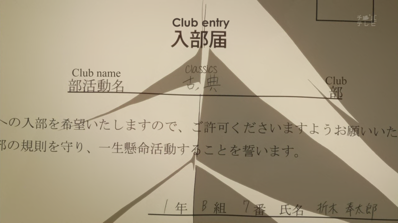
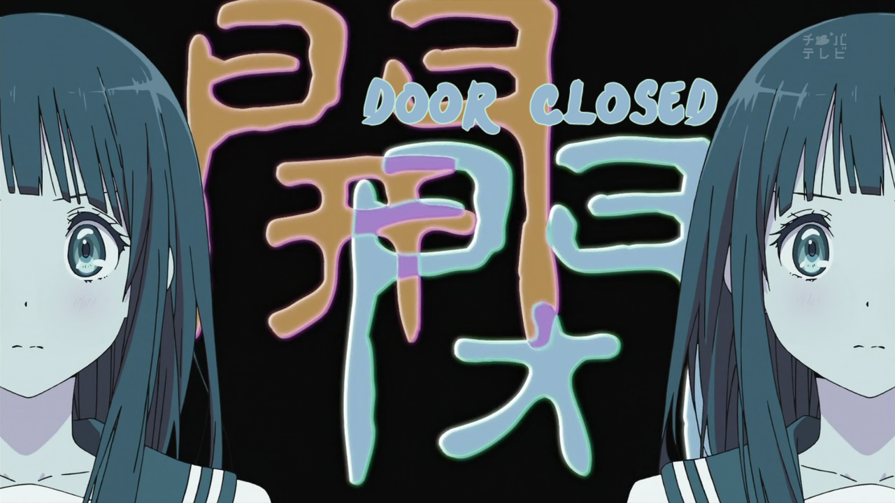
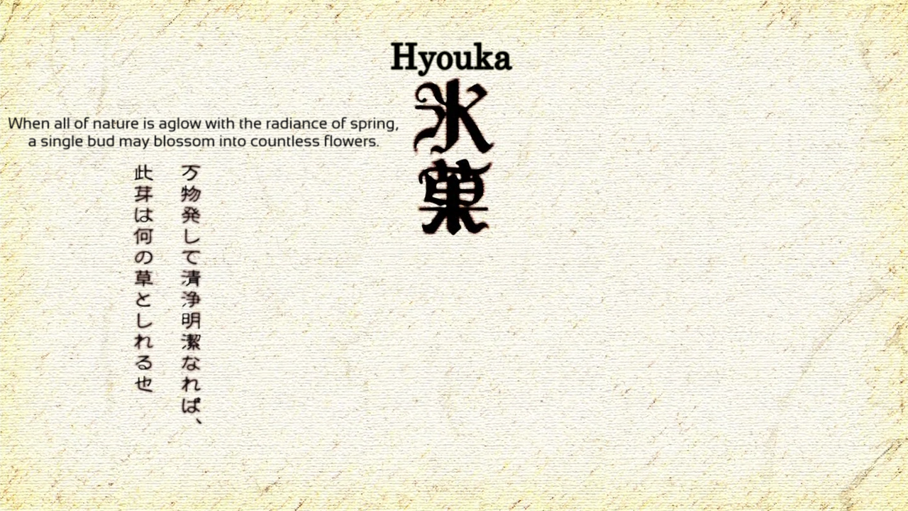
I like how Classic and Club are actually split.
Color looks off.
Font could be better.
Yeah, this looks dumb.
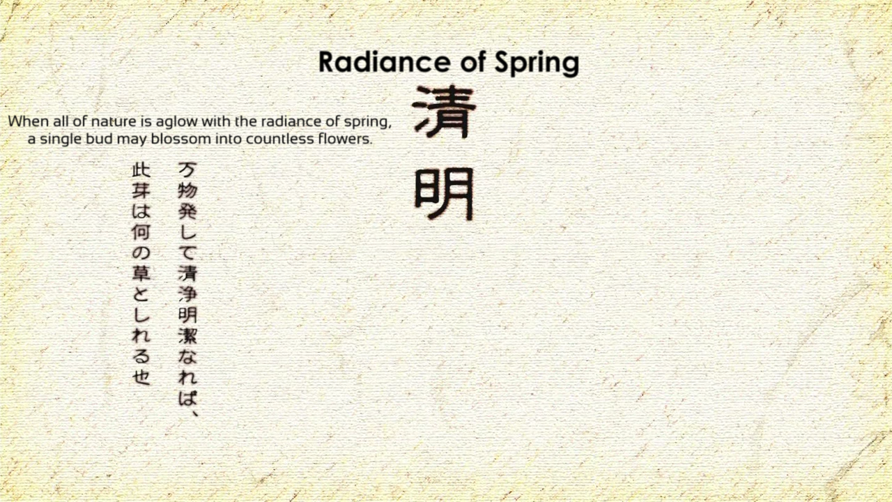
I dunno how this could be better.
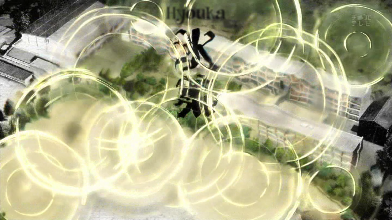
The effect could be better.
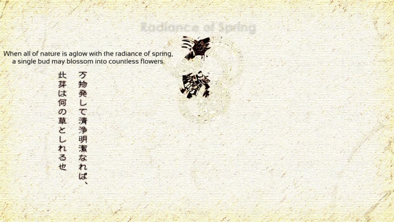
The motion is off at the beginning. I imagine both are like this because both groups used Mocha and it’s not perfect.
I like how this is done better than Mazui’s.
See above.
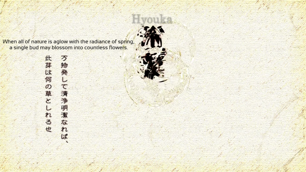
Motion is sort of bad but at least the sign is done.
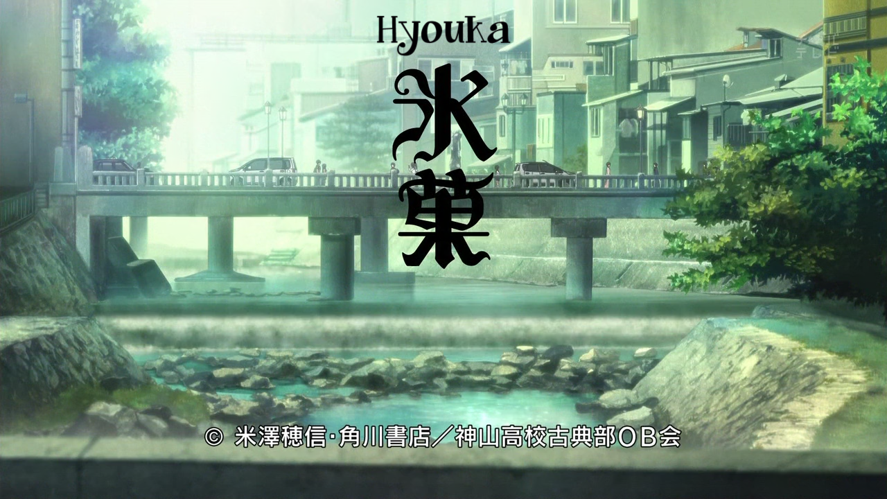
Looks like I used the wrong style for the “Hyouka” part. Whoops.
Could be better but I didn’t exactly have a lot to work with.
Yep.
Mazui
Interesting handwriting font choice.
It looks pretty bad here though.
These are good.
There are blur values other than be1, you know?
This looks kind of derp but so does mine so I don’t really fault them.
For some reason this is just a plain serif font. Also, too much blur.
Effect is nice but they tried to align it and it went past anyway so why not just make the font bigger…
Motion is a little derp at the beginning.
You know, this actually means something by itself.
Uh, okay. Not the best font, too much blur.
See above.
Guess not.
The font for “Seimei” (nice translation btw) is just wrong.
Too hard to copy the sign from the OP I guess.
Nothing terribly wrong here.
I assume this is actually important or something.
These are fine.
gg
Fine except the colors for “Book” and “Oreki Houtarou” are wrong.
These are fine.
The font should be way more “rough”.
Are you kidding me? There’s definitely enough room on the sign to put it there. Masking the thing is even an option.
Colors are all off.
Okay.
See above.
Font should be serif. No blur.
Not sure why they didn’t have a clip go across it on the way in like they did on the way out.
Color is wrong and part of the typesetting overlaps the sign once it starts rotating and moving around.
This works.
I’m not sure this does though.
This part is fine.
Both the colors should be darker.
Should be blurrier. Also, the bottom should be thinner/smaller.
This is fine except the font issue I mentioned earlier.
This looks pretty bad.
I like that it at least tried to show the light going across the sign but uh yeah the execution is awful.
Poor font choice, mask and font color are off.
No problem here.
Grades
Commie: B. Better than Mazui for most signs but Mazui did a few more, probably because they spent more time on it.
Mazui: B. Font choices could be better, like not using pointlessly large Japanese fonts for no reason. Also, how the signs were blurred could also be improved.
gg: C+. gg spent by far the most time on this (like 3-4x as much at least) and did a pretty bad job.

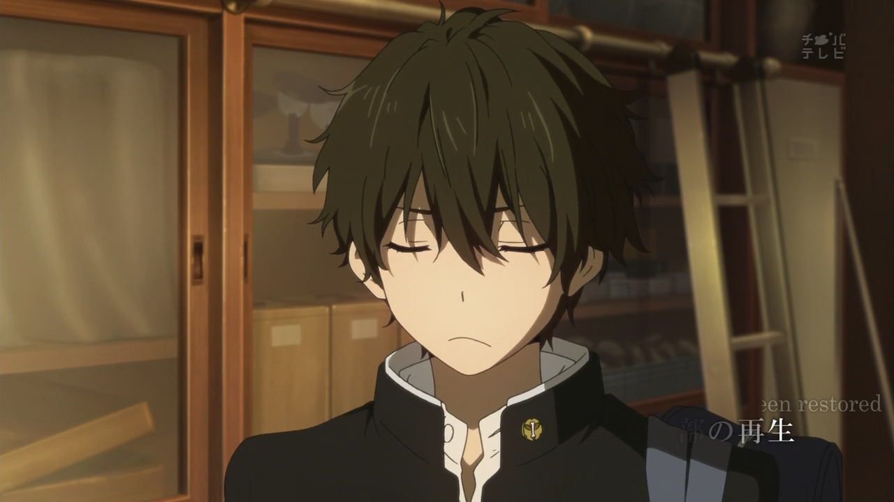
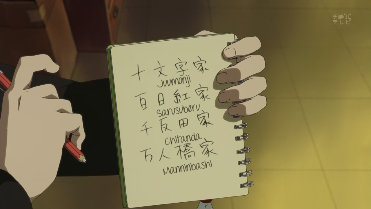
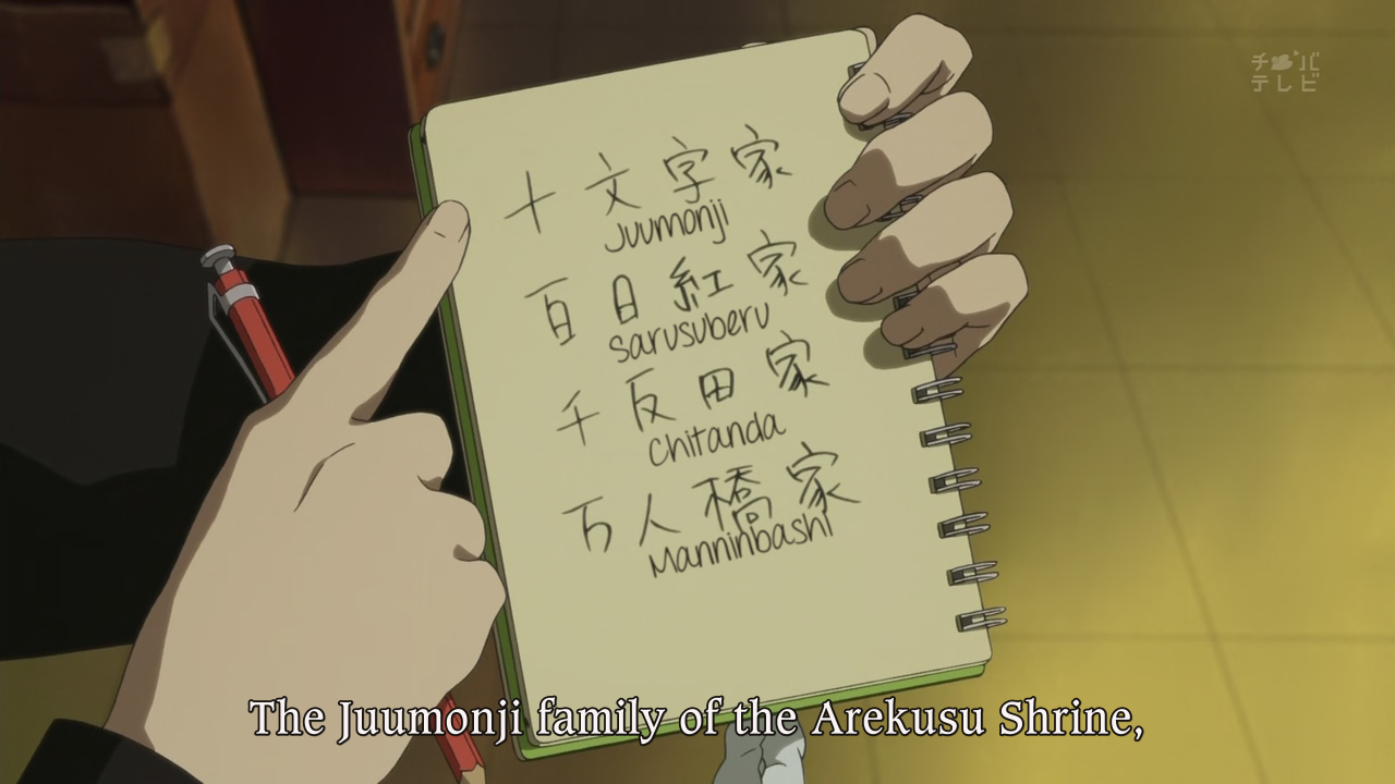
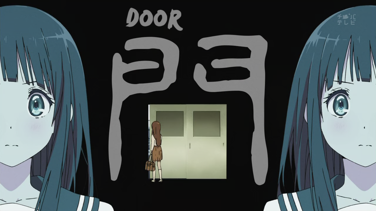
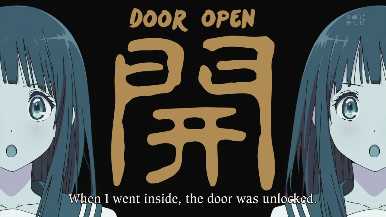
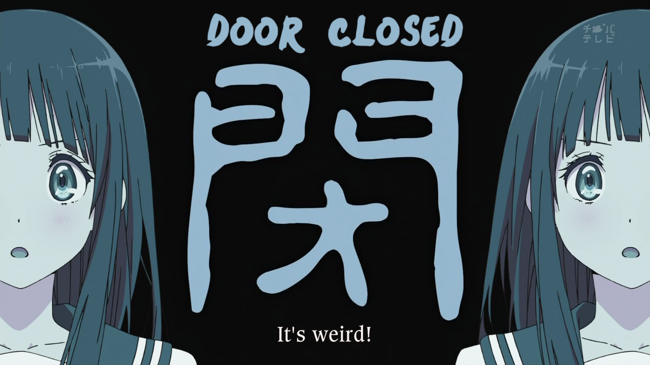
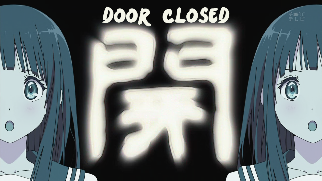
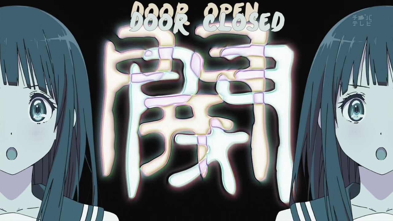

![[Mazui]_Hyouka_-_01_[8529356F]_001_2633](http://notredreviews.files.wordpress.com/2012/04/mazui_hyouka_-_01_8529356f_001_2633.png)
![[Mazui]_Hyouka_-_01_[8529356F]_001_2699](http://notredreviews.files.wordpress.com/2012/04/mazui_hyouka_-_01_8529356f_001_2699.png)
![[Mazui]_Hyouka_-_01_[8529356F]_001_4025](http://notredreviews.files.wordpress.com/2012/04/mazui_hyouka_-_01_8529356f_001_4025.png)
![[Mazui]_Hyouka_-_01_[8529356F]_001_4496](http://notredreviews.files.wordpress.com/2012/04/mazui_hyouka_-_01_8529356f_001_4496.png)
![[Mazui]_Hyouka_-_01_[8529356F]_001_4591](http://notredreviews.files.wordpress.com/2012/04/mazui_hyouka_-_01_8529356f_001_4591.png)
![[Mazui]_Hyouka_-_01_[8529356F]_001_4788](http://notredreviews.files.wordpress.com/2012/04/mazui_hyouka_-_01_8529356f_001_4788.png)
![[Mazui]_Hyouka_-_01_[8529356F]_001_6634](http://notredreviews.files.wordpress.com/2012/04/mazui_hyouka_-_01_8529356f_001_6634.png)
![[Mazui]_Hyouka_-_01_[8529356F]_001_6679](http://notredreviews.files.wordpress.com/2012/04/mazui_hyouka_-_01_8529356f_001_6679.png)
![[Mazui]_Hyouka_-_01_[8529356F]_001_8495](http://notredreviews.files.wordpress.com/2012/04/mazui_hyouka_-_01_8529356f_001_8495.png)
![[Mazui]_Hyouka_-_01_[8529356F]_001_8522](http://notredreviews.files.wordpress.com/2012/04/mazui_hyouka_-_01_8529356f_001_8522.png)
![[Mazui]_Hyouka_-_01_[8529356F]_001_8587](http://notredreviews.files.wordpress.com/2012/04/mazui_hyouka_-_01_8529356f_001_8587.png)
![[Mazui]_Hyouka_-_01_[8529356F]_001_8603](http://notredreviews.files.wordpress.com/2012/04/mazui_hyouka_-_01_8529356f_001_8603.png)
![[Mazui]_Hyouka_-_01_[8529356F]_001_13227](http://notredreviews.files.wordpress.com/2012/04/mazui_hyouka_-_01_8529356f_001_13227.png)
![[Mazui]_Hyouka_-_01_[8529356F]_001_13238](http://notredreviews.files.wordpress.com/2012/04/mazui_hyouka_-_01_8529356f_001_13238.png)
![[Mazui]_Hyouka_-_01_[8529356F]_001_14633](http://notredreviews.files.wordpress.com/2012/04/mazui_hyouka_-_01_8529356f_001_14633.png)
![[Mazui]_Hyouka_-_01_[8529356F]_001_14654](http://notredreviews.files.wordpress.com/2012/04/mazui_hyouka_-_01_8529356f_001_14654.png)
![[Mazui]_Hyouka_-_01_[8529356F]_001_14664](http://notredreviews.files.wordpress.com/2012/04/mazui_hyouka_-_01_8529356f_001_14664.png)
![[Mazui]_Hyouka_-_01_[8529356F]_001_14774](http://notredreviews.files.wordpress.com/2012/04/mazui_hyouka_-_01_8529356f_001_14774.png)
![[Mazui]_Hyouka_-_01_[8529356F]_001_14788](http://notredreviews.files.wordpress.com/2012/04/mazui_hyouka_-_01_8529356f_001_14788.png)
![[Mazui]_Hyouka_-_01_[8529356F]_001_14801](http://notredreviews.files.wordpress.com/2012/04/mazui_hyouka_-_01_8529356f_001_14801.png)
![[Mazui]_Hyouka_-_01_[8529356F]_001_21263](http://notredreviews.files.wordpress.com/2012/04/mazui_hyouka_-_01_8529356f_001_21263.png)
![[Mazui]_Hyouka_-_01_[8529356F]_001_21332](http://notredreviews.files.wordpress.com/2012/04/mazui_hyouka_-_01_8529356f_001_21332.png)
![[Mazui]_Hyouka_-_01_[8529356F]_001_26184](http://notredreviews.files.wordpress.com/2012/04/mazui_hyouka_-_01_8529356f_001_26184.png)
![[Mazui]_Hyouka_-_01_[8529356F]_001_28853](http://notredreviews.files.wordpress.com/2012/04/mazui_hyouka_-_01_8529356f_001_28853.png)
![[Mazui]_Hyouka_-_01_[8529356F]_001_28901](http://notredreviews.files.wordpress.com/2012/04/mazui_hyouka_-_01_8529356f_001_28901.png)
![[Mazui]_Hyouka_-_01_[8529356F]_001_28953](http://notredreviews.files.wordpress.com/2012/04/mazui_hyouka_-_01_8529356f_001_28953.png)
![[Mazui]_Hyouka_-_01_[8529356F]_001_30845](http://notredreviews.files.wordpress.com/2012/04/mazui_hyouka_-_01_8529356f_001_30845.png)
![[Mazui]_Hyouka_-_01_[8529356F]_001_36857](http://notredreviews.files.wordpress.com/2012/04/mazui_hyouka_-_01_8529356f_001_36857.png)
![[gg]_Hyouka_-_01_[E9789E94]_001_2636](http://notredreviews.files.wordpress.com/2012/04/gg_hyouka_-_01_e9789e94_001_2636.png)
![[gg]_Hyouka_-_01_[E9789E94]_001_2702](http://notredreviews.files.wordpress.com/2012/04/gg_hyouka_-_01_e9789e94_001_2702.png)
![[gg]_Hyouka_-_01_[E9789E94]_001_2702](http://notredreviews.files.wordpress.com/2012/04/gg_hyouka_-_01_e9789e94_001_27021.png)
![[gg]_Hyouka_-_01_[E9789E94]_001_4027](http://notredreviews.files.wordpress.com/2012/04/gg_hyouka_-_01_e9789e94_001_4027.png)
![[gg]_Hyouka_-_01_[E9789E94]_001_4498](http://notredreviews.files.wordpress.com/2012/04/gg_hyouka_-_01_e9789e94_001_4498.png)
![[gg]_Hyouka_-_01_[E9789E94]_001_4593](http://notredreviews.files.wordpress.com/2012/04/gg_hyouka_-_01_e9789e94_001_4593.png)
![[gg]_Hyouka_-_01_[E9789E94]_001_4791](http://notredreviews.files.wordpress.com/2012/04/gg_hyouka_-_01_e9789e94_001_4791.png)
![[gg]_Hyouka_-_01_[E9789E94]_001_6644](http://notredreviews.files.wordpress.com/2012/04/gg_hyouka_-_01_e9789e94_001_6644.png)
![[gg]_Hyouka_-_01_[E9789E94]_001_6687](http://notredreviews.files.wordpress.com/2012/04/gg_hyouka_-_01_e9789e94_001_6687.png)
![[gg]_Hyouka_-_01_[E9789E94]_001_8500](http://notredreviews.files.wordpress.com/2012/04/gg_hyouka_-_01_e9789e94_001_8500.png)
![[gg]_Hyouka_-_01_[E9789E94]_001_8552](http://notredreviews.files.wordpress.com/2012/04/gg_hyouka_-_01_e9789e94_001_8552.png)
![[gg]_Hyouka_-_01_[E9789E94]_001_8606](http://notredreviews.files.wordpress.com/2012/04/gg_hyouka_-_01_e9789e94_001_8606.png)
![[gg]_Hyouka_-_01_[E9789E94]_001_8612](http://notredreviews.files.wordpress.com/2012/04/gg_hyouka_-_01_e9789e94_001_8612.png)
![[gg]_Hyouka_-_01_[E9789E94]_001_13231](http://notredreviews.files.wordpress.com/2012/04/gg_hyouka_-_01_e9789e94_001_13231.png)
![[gg]_Hyouka_-_01_[E9789E94]_001_13272](http://notredreviews.files.wordpress.com/2012/04/gg_hyouka_-_01_e9789e94_001_13272.png)
![[gg]_Hyouka_-_01_[E9789E94]_001_14596](http://notredreviews.files.wordpress.com/2012/04/gg_hyouka_-_01_e9789e94_001_14596.png)
![[gg]_Hyouka_-_01_[E9789E94]_001_14660](http://notredreviews.files.wordpress.com/2012/04/gg_hyouka_-_01_e9789e94_001_14660.png)
![[gg]_Hyouka_-_01_[E9789E94]_001_14677](http://notredreviews.files.wordpress.com/2012/04/gg_hyouka_-_01_e9789e94_001_14677.png)
![[gg]_Hyouka_-_01_[E9789E94]_001_14734](http://notredreviews.files.wordpress.com/2012/04/gg_hyouka_-_01_e9789e94_001_14734.png)
![[gg]_Hyouka_-_01_[E9789E94]_001_14767](http://notredreviews.files.wordpress.com/2012/04/gg_hyouka_-_01_e9789e94_001_14767.png)
![[gg]_Hyouka_-_01_[E9789E94]_001_14771](http://notredreviews.files.wordpress.com/2012/04/gg_hyouka_-_01_e9789e94_001_14771.png)
![[gg]_Hyouka_-_01_[E9789E94]_001_14790](http://notredreviews.files.wordpress.com/2012/04/gg_hyouka_-_01_e9789e94_001_14790.png)
![[gg]_Hyouka_-_01_[E9789E94]_001_14791](http://notredreviews.files.wordpress.com/2012/04/gg_hyouka_-_01_e9789e94_001_14791.png)
![[gg]_Hyouka_-_01_[E9789E94]_001_14804](http://notredreviews.files.wordpress.com/2012/04/gg_hyouka_-_01_e9789e94_001_14804.png)
![[gg]_Hyouka_-_01_[E9789E94]_001_19394](http://notredreviews.files.wordpress.com/2012/04/gg_hyouka_-_01_e9789e94_001_19394.png)
![[gg]_Hyouka_-_01_[E9789E94]_001_21267](http://notredreviews.files.wordpress.com/2012/04/gg_hyouka_-_01_e9789e94_001_21267.png)
![[gg]_Hyouka_-_01_[E9789E94]_001_21305](http://notredreviews.files.wordpress.com/2012/04/gg_hyouka_-_01_e9789e94_001_21305.png)
![[gg]_Hyouka_-_01_[E9789E94]_001_21332](http://notredreviews.files.wordpress.com/2012/04/gg_hyouka_-_01_e9789e94_001_21332.png)
![[gg]_Hyouka_-_01_[E9789E94]_001_22245](http://notredreviews.files.wordpress.com/2012/04/gg_hyouka_-_01_e9789e94_001_22245.png)
![[gg]_Hyouka_-_01_[E9789E94]_001_22268](http://notredreviews.files.wordpress.com/2012/04/gg_hyouka_-_01_e9789e94_001_22268.png)
![[gg]_Hyouka_-_01_[E9789E94]_001_26185](http://notredreviews.files.wordpress.com/2012/04/gg_hyouka_-_01_e9789e94_001_26185.png)
![[gg]_Hyouka_-_01_[E9789E94]_001_30847](http://notredreviews.files.wordpress.com/2012/04/gg_hyouka_-_01_e9789e94_001_30847.png)
![[gg]_Hyouka_-_01_[E9789E94]_001_36845](http://notredreviews.files.wordpress.com/2012/04/gg_hyouka_-_01_e9789e94_001_36845.png)
> The motion is off at the beginning. I imagine both are like this because both groups used Mocha and it’s not perfect.
No, you see. Mocha is only as good as your track (and if your track isn’t perfect for whatever reason there is AdjustTrack for this scenario), and you can’t honestly expect stuff that rotates on the x/y planes to translate into .ass perfectly unless you manually add the tags to reflect said rotational changes, actually this even applies when importing the tracking data into AAE.
This is a perfect example of the user depending on the tool to get the job done right, vs knowing how to do it right himself and using the tool accordingly. I tracked this sign myself and got a pretty perfect track, but it just needs some adjustments to work properly as .ass data.
csb
smd
How long does it actually take to find all these different kind of fonts? because, good or bad or whatever you want to call it the attempt in itself is pretty amazing. I’ve always wanted to get into ( or at least tinker with ) typesetting but this intimidates me.
Lots of practice, trudging through font websites and seeing what fonts other people use.