Typesetting review: Kimi no Iru Machi (OVA) 1 This entry was posted by herkz.
Kimi no Iru Machi Typesetting Review
As you can probably tell by the title of this post, I’m going to review the typesetting in various Kimi no Iru Machi (OVA) releases. There will be an editing review later.
Groups: Hadena, Commie, rori, Taka
Hadena.
p.s. his name is Seo Kouji.There’s a reason no one translates these. Not to mention they’re not very well done either. The fade is completely wrong and they should start at about blur10 and go to whatever they are now.
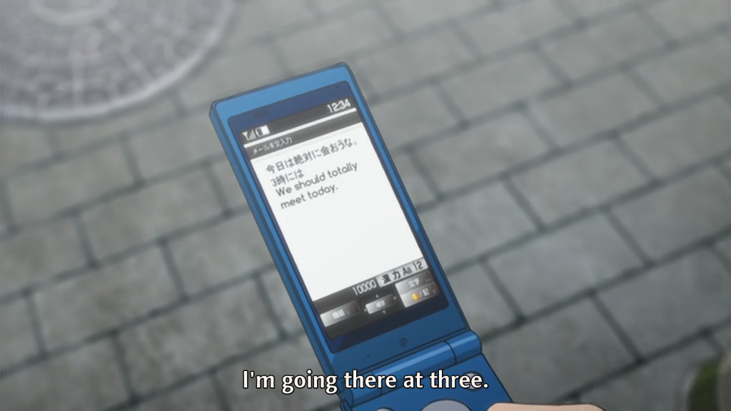
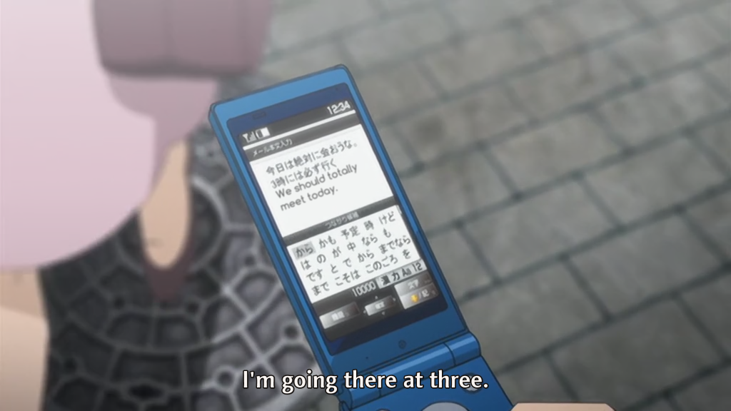
It’s kind of hard to tell from a picture but this sign moves and the Hadena typesetting doesn’t follow it very well. It could look a lot worse (which you will see in a moment).
This is one of two important signs they actually did. I’m not even sure I need to explain why it’s bad. This is the Hadena quality we’ve come to love and expect.
More pointless shit.
It’s kind of hard to show how bad this sign looks without video. In fact, their typesetting is not even on screen the entire time the sign is. If you want to see this sign done well download our release and check it out.
Commie. (tl note: this typesetting was done by me)
First sign both groups did. I’m not sure much needs to be said here.
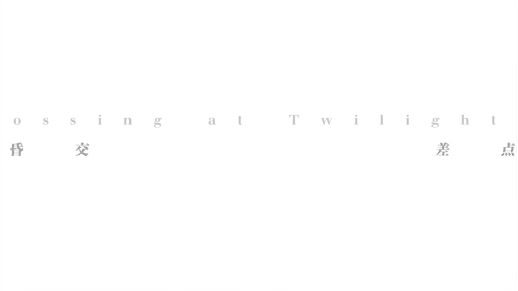
As you can see, our typesetting actually follows along with the sign.
And now, a bunch of signs we did that Hadena didn’t do it all. This isn’t really needed but I just wanted to show how lazy and bad Hadena is.
This goes back and forth between the two a few times.
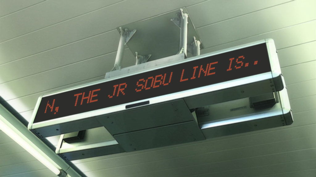
Everything except “Next Train” is typeset. Also, the middle section at the bottom scrolls left to right.
Yeah, this isn’t important or anything.
Not that important since it’s being read aloud but not very difficult either.
Not much to say here.
Wow, would you look at that. The same sign twice? It must be important.
Note that this sign moves around a lot and the typesetting is done with Mocha.
Last sign.
rori.
Yep, these look fine.
These are good too, though I can’t say I like their dialogue font.
This is pretty well done, though the top half could use some blur and the “Class” part should probably be to the right a bit.
Again, pretty good.
Yeah… the timing is a little off. Also, no blur. The at the end of the first line is also clipped off partially. Not good.
A bit hard to read but nothing wrong.
Good, but for some reason it’s a lot slower and shorter than the original.
Please use blur.
This looks like it was done with Mocha but it still jumps around a bit so I don’t really know.
Top part is rotated a bit much. This is why using fay is not the best idea.
Kind of dropped the ball here. The font is a very poor choice as well.
Good so far…
Whoops.
Yeah, this half of the sign is pretty okay.
Taka
They hardsubbed all their signs.
Grades
Hadena: F. Not only did they fail hard with the signs they did do, but they also did not do many plot-relevant signs.
Commie: A-. Hard to grade myself but I’d say most signs were done well. Only a few signs were not done but they were pointless, short and would be hard to read.
rori: C+. All the important signs are there and at least decent, but a lot of them had poor font choices and no blur or not enough blur.
Taka: H. Hardsubbing is dumb and they should feel dumb.
![[Hadena] Kimi no Iru Machi - Vol.1 [Hi10P 1024x576 x264 AAC][D06DA8C1]_001_629](http://notredreviews.files.wordpress.com/2012/03/hadena-kimi-no-iru-machi-vol-1-hi10p-1024x576-x264-aacd06da8c1_001_629.png)
![[Hadena] Kimi no Iru Machi - Vol.1 [Hi10P 1024x576 x264 AAC][D06DA8C1]_001_1029](http://notredreviews.files.wordpress.com/2012/03/hadena-kimi-no-iru-machi-vol-1-hi10p-1024x576-x264-aacd06da8c1_001_1029.png)
![[Hadena] Kimi no Iru Machi - Vol.1 [Hi10P 1024x576 x264 AAC][D06DA8C1]_001_1963](http://notredreviews.files.wordpress.com/2012/03/hadena-kimi-no-iru-machi-vol-1-hi10p-1024x576-x264-aacd06da8c1_001_1963.png)
![[Hadena] Kimi no Iru Machi - Vol.1 [Hi10P 1024x576 x264 AAC][D06DA8C1]_001_4557](http://notredreviews.files.wordpress.com/2012/03/hadena-kimi-no-iru-machi-vol-1-hi10p-1024x576-x264-aacd06da8c1_001_4557.png)
![[Hadena] Kimi no Iru Machi - Vol.1 [Hi10P 1024x576 x264 AAC][D06DA8C1]_001_16840](http://notredreviews.files.wordpress.com/2012/03/hadena-kimi-no-iru-machi-vol-1-hi10p-1024x576-x264-aacd06da8c1_001_16840.png)
![[Hadena] Kimi no Iru Machi - Vol.1 [Hi10P 1024x576 x264 AAC][D06DA8C1]_001_32377](http://notredreviews.files.wordpress.com/2012/03/hadena-kimi-no-iru-machi-vol-1-hi10p-1024x576-x264-aacd06da8c1_001_32377.png)
![[Hadena] Kimi no Iru Machi - Vol.1 [Hi10P 1024x576 x264 AAC][D06DA8C1]_001_32381](http://notredreviews.files.wordpress.com/2012/03/hadena-kimi-no-iru-machi-vol-1-hi10p-1024x576-x264-aacd06da8c1_001_32381.png)
![[Hadena] Kimi no Iru Machi - Vol.1 [Hi10P 1024x576 x264 AAC][D06DA8C1]_001_32456](http://notredreviews.files.wordpress.com/2012/03/hadena-kimi-no-iru-machi-vol-1-hi10p-1024x576-x264-aacd06da8c1_001_32456.png)

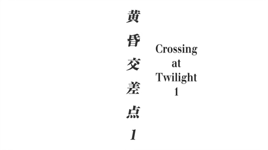


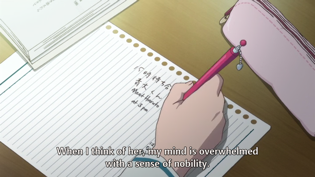
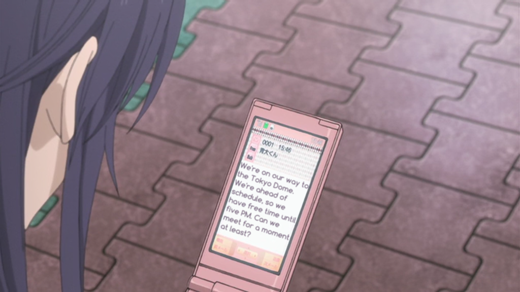





![[rori] Kimi no Iru Machi OVA - 01 [72D0DABC]_001_608](http://notredreviews.files.wordpress.com/2012/03/rori-kimi-no-iru-machi-ova-01-72d0dabc_001_608.png)
![[rori] Kimi no Iru Machi OVA - 01 [72D0DABC]_001_623](http://notredreviews.files.wordpress.com/2012/03/rori-kimi-no-iru-machi-ova-01-72d0dabc_001_623.png)
![[rori] Kimi no Iru Machi OVA - 01 [72D0DABC]_001_2514](http://notredreviews.files.wordpress.com/2012/03/rori-kimi-no-iru-machi-ova-01-72d0dabc_001_2514.png)
![[rori] Kimi no Iru Machi OVA - 01 [72D0DABC]_001_2537](http://notredreviews.files.wordpress.com/2012/03/rori-kimi-no-iru-machi-ova-01-72d0dabc_001_2537.png)
![[rori] Kimi no Iru Machi OVA - 01 [72D0DABC]_001_3006](http://notredreviews.files.wordpress.com/2012/03/rori-kimi-no-iru-machi-ova-01-72d0dabc_001_3006.png)
![[rori] Kimi no Iru Machi OVA - 01 [72D0DABC]_001_4539](http://notredreviews.files.wordpress.com/2012/03/rori-kimi-no-iru-machi-ova-01-72d0dabc_001_4539.png)
![[rori] Kimi no Iru Machi OVA - 01 [72D0DABC]_001_5173](http://notredreviews.files.wordpress.com/2012/03/rori-kimi-no-iru-machi-ova-01-72d0dabc_001_5173.png)
![[rori] Kimi no Iru Machi OVA - 01 [72D0DABC]_001_5174](http://notredreviews.files.wordpress.com/2012/03/rori-kimi-no-iru-machi-ova-01-72d0dabc_001_5174.png)
![[rori] Kimi no Iru Machi OVA - 01 [72D0DABC]_001_5175](http://notredreviews.files.wordpress.com/2012/03/rori-kimi-no-iru-machi-ova-01-72d0dabc_001_5175.png)
![[rori] Kimi no Iru Machi OVA - 01 [72D0DABC]_001_5191](http://notredreviews.files.wordpress.com/2012/03/rori-kimi-no-iru-machi-ova-01-72d0dabc_001_5191.png)
![[rori] Kimi no Iru Machi OVA - 01 [72D0DABC]_001_11085](http://notredreviews.files.wordpress.com/2012/03/rori-kimi-no-iru-machi-ova-01-72d0dabc_001_11085.png)
![[rori] Kimi no Iru Machi OVA - 01 [72D0DABC]_001_12246](http://notredreviews.files.wordpress.com/2012/03/rori-kimi-no-iru-machi-ova-01-72d0dabc_001_12246.png)
![[rori] Kimi no Iru Machi OVA - 01 [72D0DABC]_002_13672](http://notredreviews.files.wordpress.com/2012/03/rori-kimi-no-iru-machi-ova-01-72d0dabc_002_13672.png)
![[rori] Kimi no Iru Machi OVA - 01 [72D0DABC]_001_17046](http://notredreviews.files.wordpress.com/2012/03/rori-kimi-no-iru-machi-ova-01-72d0dabc_001_17046.png)
![[rori] Kimi no Iru Machi OVA - 01 [72D0DABC]_001_17706](http://notredreviews.files.wordpress.com/2012/03/rori-kimi-no-iru-machi-ova-01-72d0dabc_001_17706.png)
![[rori] Kimi no Iru Machi OVA - 01 [72D0DABC]_002_30631](http://notredreviews.files.wordpress.com/2012/03/rori-kimi-no-iru-machi-ova-01-72d0dabc_002_30631.png)
![[rori] Kimi no Iru Machi OVA - 01 [72D0DABC]_001_32336](http://notredreviews.files.wordpress.com/2012/03/rori-kimi-no-iru-machi-ova-01-72d0dabc_001_32336.png)
![[rori] Kimi no Iru Machi OVA - 01 [72D0DABC]_001_32368](http://notredreviews.files.wordpress.com/2012/03/rori-kimi-no-iru-machi-ova-01-72d0dabc_001_32368.png)
![[rori] Kimi no Iru Machi OVA - 01 [72D0DABC]_001_32381](http://notredreviews.files.wordpress.com/2012/03/rori-kimi-no-iru-machi-ova-01-72d0dabc_001_32381.png)
![[rori] Kimi no Iru Machi OVA - 01 [72D0DABC]_001_32383](http://notredreviews.files.wordpress.com/2012/03/rori-kimi-no-iru-machi-ova-01-72d0dabc_001_32383.png)
![[rori] Kimi no Iru Machi OVA - 01 [72D0DABC]_001_32394](http://notredreviews.files.wordpress.com/2012/03/rori-kimi-no-iru-machi-ova-01-72d0dabc_001_32394.png)
![[rori] Kimi no Iru Machi OVA - 01 [72D0DABC]_001_32454](http://notredreviews.files.wordpress.com/2012/03/rori-kimi-no-iru-machi-ova-01-72d0dabc_001_32454.png)
![[rori] Kimi no Iru Machi OVA - 01 [72D0DABC]_001_32455](http://notredreviews.files.wordpress.com/2012/03/rori-kimi-no-iru-machi-ova-01-72d0dabc_001_32455.png)
![[rori] Kimi no Iru Machi OVA - 01 [72D0DABC]_001_32463](http://notredreviews.files.wordpress.com/2012/03/rori-kimi-no-iru-machi-ova-01-72d0dabc_001_32463.png)